
We've covered a lot so far. Text & font manipulation, images, links. As far as the basics go, there's not a whole heck of a lot more.
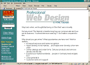
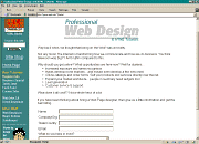
I think I'm going to take this time to tell you about screen resolution. The screen I work on is 640 pixels by 480 pixels. That means that the screen is divided into 640 dots (pixels) horizontally and 480 dots vertically. Most people use 800x600, some use 1024x768 and some even use a higher resolution. What does this have to do with anything? It has a lot to do with how your pages will look to them. Here are a couple screen shots of my old homepage at different resolutions.
|
|
|
| 640×480 | 800×600 | 1024×768 |
It is a very good idea to check your page at other resolutions. Your carefully crafted layout might fall apart at other resolutions. Especially if you design your page at a higher resolution. View your creation at a lower res and you might be surprised. For Windows95 users, there is a handy little MS Powertoy called Quickres that lets you easily switch screen resolutions.
What resolution to design for is an ongoing debate. The ideal is not to design for ANY particular resolution at all. Ideally your pages should be presentable at all resolutions. Since idealistically this is possible and realistically it's not, a nice compromise is to design for a minimum horizontal resolution of about 560, then test your layout at a few different resolutions. While this is a fine compromise, it's still not enough for some folks. Some are content in the knowledge that since "most" people run at 800x600, that's what they will design for. Just be careful when you're page layout is as fragile as a house of cards. The more you fiddle with exact layout, the less dependable that layout will be. Your finely crafted page may fall apart for more people than you realize. Web page layout is not an exact thing even under the best of circumstances... keep it loose, keep if flexible, test your pages with a couple browsers and at a few resolutions.
Now we are going to look at a couple formatting tools availble to you. First one is <BLOCKQUOTE>. In most browsers it pulls your margins in from both sides. (I don't know if that's the proper terminology but if you understand what I mean I guess it's close enough).
<BODY>
<BLOCKQUOTE>
WE THE PEOPLE of the United States, in order to form a more perfect
Union, establish Justice, insure domestic Tranquility, provide for the
common defense, promote the general Welfare, and secure the Blessings
of Liberty to ourselves and our Posterity, do ordain and establish this
Constitution for the United States of America.
</BLOCKQUOTE>
</BODY>
 WE THE PEOPLE of the United States, in order to form a more perfect Union, establish Justice, insure domestic Tranquility, provide for the common defense, promote the general Welfare, and secure the Blessings of Liberty to ourselves and our Posterity, do ordain and establish this Constitution for the United States of America. |
 I'm sure when <BLOCKQUOTE> was first devised it had a loftier purpose, such as quoting profound bits of prose from authors I've never even heard of. But here in the trenches it serves a more mundane purpose... easy indenting.
It's important to note that although most browsers render blockquoted text by indenting it, that's not specifically what it's designed to do. It's conceivable that some future browser may render blockquoted text in some other way (such as red italics). That said however, for the time being, it is perfectly safe to indent blocks of text with <BLOCKQUOTE>.
| << BACK NEXT >> |
| Upload Your Pages Color Chart Practice Exercises Color Picker |
| Index & Quick Reference Barebones HTML Guide Table of Contents |
| Print version available PageTutor.com membership |
|
Selfonline-education FREE LINK SHOPPING FREE GIFT
|
|